
Stapled To The Bench articles are written by a guy who was a programmer at Statistics Canada. My work experiences have shown me how useful a good chart can be. I’ve also seen bad charts, and they are worse than useless.
My hope for STTB is that the charts I use are clear and meaningful. In this article, I’ll go through the most frequently used charts of STTB in detail. While player information will be displayed, the focus will be on the idea of what is being displayed, rather than the player.
The Prologue
While I was creating a presentation for an international conference, my director asked me to include a chart created by another employee. I had a style for my slides. They had to have a meaningful title, no more than 20 words, and one image. I kept my speaking notes in a separate document, rather than displaying them on the slide. Have you ever been at a presentation where the presenter just read their slides, word for word? It is a terrible experience for the audience.
The slide I was to include was a hot mess. It had two detailed charts, another image that looked like the blocking scheme for an offensive line on a power sweep, and yet another image the looked like an electrical circuit diagram. Salvador Dali would have said that it was too abstract. It had almost one hundred words of text as well, with the font setting so small that the text was unreadable unless you were standing right beside the projected image. I didn’t know you could set font size to 0.3.
I included this slide in my presentation because I follow director-level orders. But neither my director nor anybody who knew the person who created the chart was at the conference. Further adding to my luck was that I was the only person from Stats Can at this session. I was able to introduce the chart with the phrase “as you can see from this chart, somebody has way too much time on their hands.” I then took a couple of minutes to highlight the important part of the slide, because the information it was trying to provide was important. Neither the blocking scheme nor the circuit diagram were important.
Now let’s take a look at the frequently used charts at Stapled To The Bench. I’m certain they will not be mistaken for circuit diagrams, blocking schemes or Ikea construction plans.
Productivity Rating Chart
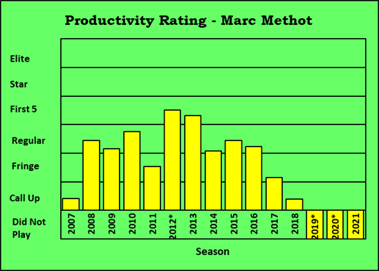
The Productivity Rating chart shows a player’s seasonal PR-Scores. In this specific case, the player is Marc Methot.
If a player played before 2007 (as Mr. Methot did), nothing can be displayed. The statistics required for PR calculations are not publicly available for those seasons.
Season identifiers are at the bottom of the chart. Three seasons have asterisks because they are the non-82 game seasons (lockout, pandemic, pandemic). If a player didn’t play in a season, the season identifier at the bottom of the chart will be encased in a yellow bar.
On the left you’ll see the PR-Categories, rather than the PR-Score scale. That was done on purpose: the category labels provide context about the player-ratings that numbers don’t. It is meaningful to know that Marc Methot’s rating in 2013 was PR-First5. That his PR-Score was 6.6114 or 6.3076 or 6.8219 is trivial. That the scale for PR-Score is zero to twelve-ish is trivial: the purpose of PR-Score is to place a player in a PR-Category.
Each bar shows the player’s PR-Score for a season. The higher the bar, the better the season.
Marc Method had a good career. His best seasons were 2012 and 2013, getting off to a flying start in Ottawa. He got a lot of ice-time with Erik Karlsson, if memory serves. A persistent back injury limited him to 45 games in 2014, and he never recovered his best form. He retired after the 2018/2019 season.
There are six categories to Productivity Rating, so I’ve selected six selected players to use as examples for the charts. Each player typically fits into a specific category.
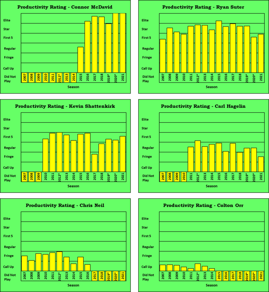
Connor McDavid is a chart-breaker. His 2020 and 2021 seasons are literally off-the-chart. I didn’t think it reasonable to create another category (PR-Ultra? PR-McDavid?) just for him. On the other end of the scale is Colton Orr, who is the player you get when you take Chris Neil and remove all offensive skills.
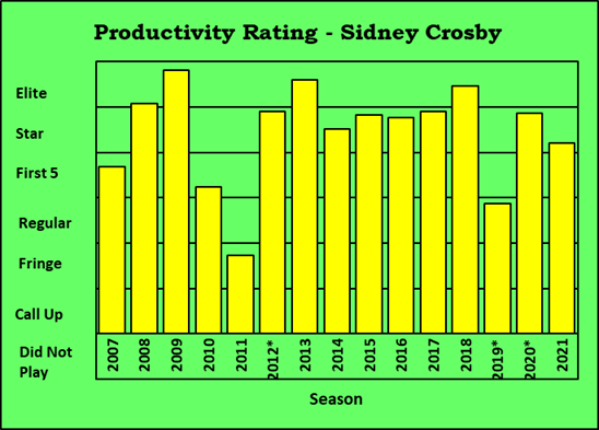
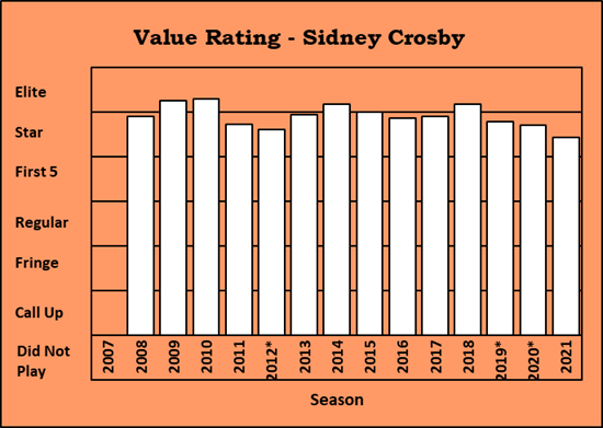
Finally, let’s look at Sidney Crosby’s career PR chart. It doesn’t look as you’d expect it to. For instance, in 2011 Crosby was in the PR-Fringe category. Seriously?
Shattenkirk’s chart has a dip at 2017, Hagelin’s has them at 2016 and 2018, and Chris Neil’s 2014 is low. There is a common reason for all these lower ratings: missed games due to injuries.
PR measures a player’s contribution in a season, based solely on what he did in that season. If a player plays a fraction of a season, his statistical counts will be low, his PR-Score will be low, and that season’s bar will be lower than normal. If a player is healthy for many seasons in a row (Ryan Suter), his PR chart doesn’t show a lot of fluctuation.
Crosby has significant injuries in 2010, 2011 and 2019. The next chart shows how much a player plays in each season in two ways. A little busy, but Salvador Dali would improve.
Games Played and Minutes Per Game Chart – GP and MPG
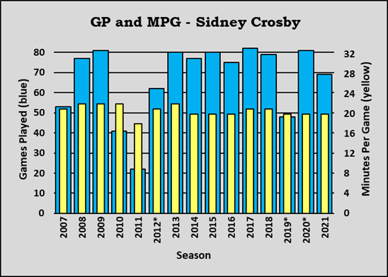
This chart shows two measures of how much players play: games played and minutes per game. The thick blue bars represent games played, and the thin yellow bars show minutes per game.
The scale for games played is on the left. In the asterisk seasons (2012, 2019, 2020), a player’s actual games played are adjusted to an 82-game schedule. In 2012, Crosby played 36 of 48 games: that’s the same as 62 games in an 82-game schedule.
The scale for minutes per game is on the right side of the chart. From 2007 through 2013, Crosby was regularly above 20 minutes per game (except for 2011). Since 2014, he has consistently been close to 20 minutes per game.
The Productivity Rating chart for Mr. Crosby had three unusual dips (2010, 2011, 2019). His GP and MPG chart showed the reason for these dips, as he played far fewer games than normal in 2010, 2011 and 2019.
Here are the GP and MPG charts for the six selected players.
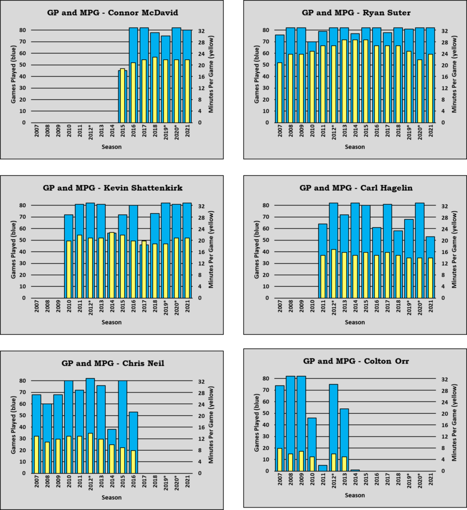
Ryan Suter’s PR numbers have been dropping these last two years, but he hasn’t missed any games. What he has missed is minutes per game: three minutes less per game is the same as four fewer games per season. A drop in minutes per game is the signal that a player’s career is coming to an end, but that end could still be a couple of seasons away.
On Colton Orr’s chart you’ll notice that his 2011 and 2014 seasons do not have a minutes per game column. MPG is only calculated for players who played 10 or more games in a season.
The GP and MPG charts show why a player’s PR would be lower. Value Rating (VR) was created to describe the player rather than a player’s specific season. VR also reduces the impact of games missed due to injuries.
Value Rating Chart
The Value Rating chart shows a player’s seasonal VR-Scores. VR is calculated from three (or two) seasons of play and shows a player’s value at the end of a season. The chart is identical in structure to the PR chart because VR uses the same scale as PR.
Basically, VR is an optimistic estimate of a player’s PR, showing the type of season he’d have if he missed fewer games. It’s like saying Boone Jenner could have scored 30 goals last season if he hadn’t missed so many games.
One of the requirements for VR calculation is that a player must have played at least half of the scheduled games in the previous three years. That’s 124 or more games (more than half of 246 games) – adjustments are made to this criterion for the shortened seasons. Some players have VR in 2008 because they played more than 123 games in 2007 and 2008, as did Crosby.
The VR chart is much smoother in its year-to-year transitions than the PR chart, which can be expected when you are using a bigger amount of data and reducing the impact of missed games. The COVID charts (all the rage a while ago) used seven-day averages to smooth their lines. A chart of the daily numbers resembled a close-up of a saw blade.
Crosby’s VR chart has a dip in 2010 and 2011, corresponding to his injuries. The missed-games correction in the VR calculation reduces, but does not eliminate, games missed. VR does not assume that every player would have played 82 games.
One cannot help but notice that Crosby’s VR-Scores have been dropping since 2018: he is getting old. From my vantage point, I do not consider 35 as “old.” But Sidney is a professional athlete in a high-energy high-impact sport, and 35 is “old” in that context. He can continue to play while his value continues to slip, because his starting value was extremely high.
Crosby is essentially the same age as Usain Bolt, who hasn’t run a competitive race in five-plus years.
Here are the Career Value Rating charts for the six selected players. As noted earlier, the season-to-season transitions are very slight. Suter’s value from 2013 through 2019 barely changed; Shattenkirk’s value from 2011 through 2016 barely changed. Hagelin’s value has been gently descending, and Chris Neil’s value was dropping more quickly towards the end of his career. Neil’s value in 2016 was about half his 2011 value, while Hagelin’s 2021 value was 70% of his 2012 value.
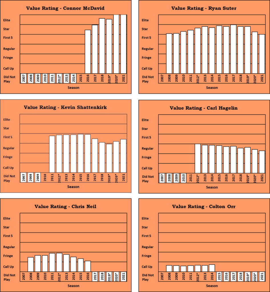
I make no apology for players like Colton Orr being lowly ranked; I will point out that he is lowly ranked compared to other NHL players. In a beer league, he’d be a massive super star who scored at will. In the NHL, he’s being compared against the best of the best.
Sankey Diagram – My Favourite Toy
I really like Sankey diagrams. They show how things progress over time or across stages. And you, too, can create a Sankey diagram: just have your data ready and visit the website sankeymatic.com!
I am going to use Sankey diagrams in an article about when players hit their career peak. One of the ways to define the peak of a career is that it’s the age when players’ values in the subsequent season first has more decreases than increases. While you can show that with just the numbers, a Sankey diagram shows it clearly, meaningfully and succinctly.
Below is a Sankey diagram of players who had a PR-Regular season at age 20. Explanations will follow.
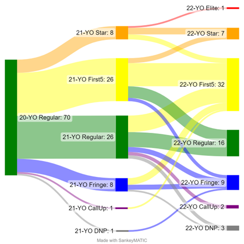
Chart colours were assigned (by me) to the PR-Categories using the red-orange-yellow-green-blue-indigo-violet spectrum scale. Only six colours are needed for the categories, so I decided to use purple instead of indigo/violet. The PR-Category colour scale is: red-orange-yellow-green-blue-purple. Grey indicates the player did not play (DNP).
Labels on the chart describe a state and its count, using the format [state: count]. The starting state is a group of 20-year-olds who were PR-Regular. There were 70 of them. That’s what [20-YO Regular: 70] means.
The vertical bars represent a state at a point in time, while the horizontal flows show how the state changed while transitioning to the next point in time. The height of the bars and the height of the flows are proportional to the number of elements (players) involved. 70 players were in the start group, and that green bar is “7o players high.” Eight players dropped to PR-Fringe category as 21-year-olds, so the horizontal flow to the blue bar in the lower center area of the chart, and the blue bar itself, are both “8 players high.”
What is this chart telling us? The starting group on the left are all in one state: 20-year-old players who had a PR-Regular season. Two years later, they had seasons that covered every PR-Category, from PR-Elite to PR-CallUp to DNP (Did Not Play). More players improved than declined over those two seasons.
Who were these 20-year-old PR-Regulars? Aaron Ekblad was one of them (he was PR-Star and PR-First5 then next two seasons). Boone Jenner went PR-Fringe (injury) and PR-First5 the next two seasons. Brayden Point: PR-Star, PR-Star. Dylan Larkin went PR-Star then PR-Elite. On the other hand, Christian Dvorak went PR-Regular then PR-CallUp.