I’m as surprised as you are about this: I was listening to the sermon at church. It wasn’t a fire-and-brimstone sermon, as I wouldn’t go to that type of church. But the sermon is usually a nice little break where I can catch a morning mini-nap.
The sermon talked about a journey from curiosity to analysis to knowledge, which made me think about the articles I write for Stapled To The Bench (STTB), especially with regard to player rating systems.
Curiosity
Curiosity is a strong desire to know or learn something.
As the sermon went on (and on, and on, as all sermons do) I started thinking about statistics. I had just re-read a Bill James article on Win Shares (baseball), and I had just written an article on the “importance” of statistics. Mr. James assessed the impact of player performance in a combination of several statistics on their team’s overall performance.
I was curious whether players with high Productivity Rating Scores (PR-Scores) would also be at the top of a rating system based on the importance of statistics. I mean, they should be, shouldn’t they? Unless there is something wrong with Productivity Rating.
Analysis
Analysis is the detailed investigation of the structure of something. In this instance, the “something” is “hockey statistics.”
For this new rating system, the analysis was coupled with experimentation. In the development of any rating system, it is necessary to “play with the weights” so that the objective results match subjective expectations. Who is going to believe a rating system is accurate if it identifies Sebastian Aho (F, CAR) as the best player in the league?
Knowledge
Knowledge is information acquired through education, or learning. Using statistics and formulas to categorize hockey players can lead to knowledge. Perhaps a new rating system could lead to a greater understanding of the contributions of some players.
Let’s see what knowledge I can acquire.
Point Share: A New Rating System
Point Share is a new rating system. Its unit of measurement for a player is standing points. Its value represents how many standing points the player “is responsible for” had he played for a middle-of-the-pack team.
Point Share uses weighted statistics, weights which were heavily influenced by an earlier article called The Importance of Statistics – From Goals to Hits.
Most of the statistics STTB has created consist of a specific numeric measurement (a score) and categories which contain groups of players based on their scores. Point Share is no different. The numeric component is called PtShare, and its specific value will be rounded to the nearest 0.5 points. For example, Adam Fox’s specific score of 9.3 was rounded to 9.5.
Point Share has six categories that use the same suffixes as Productivity Rating: Pt-Elite, Pt-Star, Pt-First5, Pt-Regular, Pt-Fringe and Pt-CallUp.
The Statistics Being Used: Cost Implications
Almost all of the articles written for Stapled To The Bench (STTB) use data that is freely available. This perfectly fits my personal level of disposable income (I’m a pensioner) and the goal of not monetizing STTB (no advertisements or fees).
The one time I paid for data it was because curiosity got the better of me. I don’t regret it and I may repeat it, but my natural cheapness keeps my spending habits well in check.
The Statistics Being Used: Season Level
A player will be evaluated on what he did in a specific season. Players that miss games will have lower ratings than they would have had, had they played all 82 games.
Jack Hughes (F, N.J) has a PtShare of 7.5, making him Pt-First5. That’s pretty good for a guy who played only 62 games. Had he played 82 games he probably would have had a PtShare of 9.5 (Pt-Star). His PtShare accurately reflects the fact that he missed 20 games.
The Statistics Being Used: Counts vs. Percentages
As I see it, counts are measures and percentages are descriptions. When dealing with a large amount of data either is acceptable: at the end of a baseball season, batting average is both an accurate measure and an accurate description for a player who got to bat 500 times.
When dealing with small amounts of data only counts are acceptable. At the end of a game, an announcer might say the current batter was two-for-three so far. He would never say his batting average for the game was .667.
It’s the same for hockey. Rate statistics (percentages, per game) are only meaningful if a player has a large number of events or games from which the rate statistic is calculated. Andrew Copp’s (DET) faceoff winning percentage of 53.5%, while Alex Nylander (CBJ, PIT) had a 100% faceoff winning percentage. The true picture comes from counts. Copp won 536 of 1,001 faceoffs, while Nylander won three of three.
The Data Being Used: Frustration #1 – Defensive Statistics
While Productivity Rating is influenced by offense, Point Share is swamped by it. Freely available NHL defensive statistics barely exist. Watching a televised game I have heard statistics like “puck battles won” and “zone time”: those data are not freely available.
The main defensive statistics I use are defensive zone faceoffs and penalty kill time. If a player has a high count of defensive zone faceoffs and is given a lot of penalty kill time, he is a good defensive player.
The Data Being Used: Frustration #2 – Defensemen vs. Forwards
As noted in the first frustration, Point Share is swamped by offensive context. As noted in real life, most defensemen don’t score very much. 113 forwards had at least 50 points last season, as compared to only 20 defensemen.
To recognize a defenseman’s contribution, Point Share rewards defensemen who played over 1,230 minutes in the season. Defensemen who play a lot must be doing something right, so rewarding them for their time on ice is appropriate.
The Point Share Formula, Basically
I would normally explain exactly how players are being evaluated, as it would allow the reader to verify the results by copying the method (which assumes the reader is a dab hand at Excel). In order to shorten this article by at least a half-dozen pages, I won’t be doing that now. I may get around to writing a technical article that precisely defines the formula sometime in the future.
For each selected statistic I determined the total value for all players. As an example, the total expected goals for (xGF) in the NHL was 40,286. I then chose a multiplier for the statistic so that the product (xGF * xGFMULTIPLIER) would be close to 10,000. Using a multiplier of 0.250 made the product 10,073. The reason I chose “close to” rather than “exactly” is that the total of xGF will be different in different seasons. I don’t want to calculate season-specific multipliers, even though it would be easy (xGFMULTIPLIER = 10,000/xGF).
Each player would get a weighted xGF value using xGFMULTIPLIER and his actual xGF, creating a datum called w.xGF. Ryan O’Reilly (F, NSH) had xGF = 111.16 and w.xGF = 27.8.
Gathering all of the weighted values for all players, I then developed a formula that assigned a different weight to each weighted statistic. This second weight respected that datum’s importance to winning. I tuned these second-level weights until the sum of the weighted values gave the best players a PtShare value in the 10.0+ range.
Point Share and Its Range of Values
You may wonder why Point Share was designed so that the top players in the league would get a PtShare of 10.0 or a little more. One has to consider how many points a single player could possibly be responsible for, and also consider that a team dresses eighteen players. All eighteen players are, to varying extents, responsible for their team’s successes. Adding the PtShare values of all players on a team should produce a value that is reasonably in the range of points a team can get in a season.
I wanted PtShare to reflect a player’s value on a team that had 95 standing points in a season. If I said that one player was worth 50 points, that means the other seventeen players would be worth a total of 45 points. That just makes no sense at all: McDavid is worth 50 points and Draisaitl is worth 5 points? They should be close to equal. If an extremely good player is worth 12 points (McDavid’s PtShare is 12.0), that leaves room for his teammates to get fair evaluations as well (Draisaitl’s PtShare is 11.5). In his best seasons, Wayne Gretzky wasn’t worth 50 standing points to his team
Selected Statistics
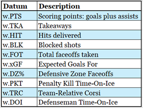
To be clear, blocked shots mean the number of shots a player blocked and not the number of times a player’s shot was blocked.
Defensive zone faceoffs used a percentage, but if a player was involved in fewer than 600 faceoffs he would be assigned a value of 0.
For traded players, team-relative Corsi was calculated for each team he played for and the total across all teams was used.
Defenseman Time-On-Ice (DOI) was used to get a better balance of defensemen in the top 100 players. Without this balancing factor, the top 100 players consisted of 89 forwards and 11 defensemen. With it, the top 100 had 63 forwards and 37 defensemen.
PtShare – League Level Counts by Category
Insofar as how the players fell into categories, PtShare seems accurate. About 2% of players were in the Elite category, and each subsequent category had more players. This describes the talent pool of players in any professional league. The PtShare distribution is quite similar to the distribution of Productivity Rating.
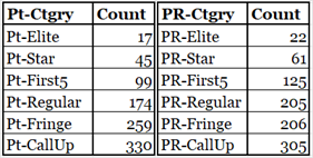
If anything, Pt-Share is a little stricter in its ratings. It has fewer Elites, Stars and First5s.
The next table shows the counts of players by their PR and Pt categories. More than 70% of players are in the same category (counts presented in bold). The yellow-shaded boxes indicate where players are two categories apart in the rating systems.
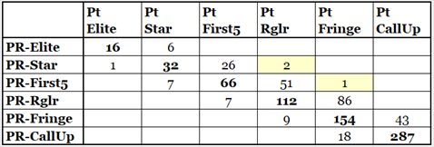
Trevor Moore (PR-Score 8.12, Pt-Score 5.7) and Mario Ferraro (PR-Score 8.07, Pt-Score 5.6) are both at the bottom of the PR-Star category and the top of the Pt-Regular category. I view their two-category separation as nothing more than coincidental: a minor change in either formula could have them only one category apart.
Radko Gudas (PR-Score 6.32, Pt-Score 3.1) is a little above the bottom of the PR-First5 category and in the middle of the Pt-Fringe category. I view this two-category separation as bad luck for Gudas. His Pt-Score is lower because he is a low-scoring defenseman who didn’t get a lot of ice time (66 games played). Both PR-Score and Pt-Score give defensemen a bonus for their ice-time, but the Pt-Score bonus is stingier.
I was very surprised there were only three “two-category” differences.
The PtShare vs. PR table above shows that both formulas produce reasonably similar results. Good players in one system are usually good in the other.
The Top Players in Pt-Share (2023-24)
The following table shows the top 30 players in Pt-Share in the 2023-24 season. The Pt-Elite players are Nathan MacKinnon through John Carlson (PT-Share 10.0 and above).
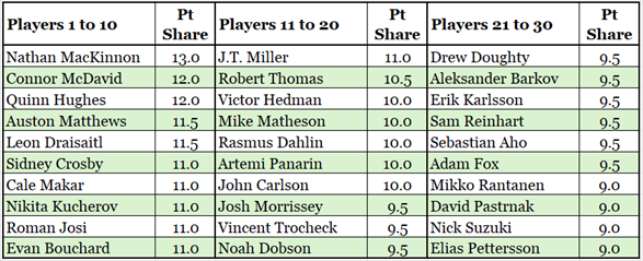
Would any rating system be seen as reasonable if it didn’t have MacKinnon, McDavid and Matthews near the very top?
Canadian Corner – Top Three Players in Pt-Share for the Canadian Franchises

Edmonton and Vancouver had three excellent players having excellent seasons.
It might surprise you to see Toronto being third on this list, well behind the second-place Vancouver Canucks. Marner missed 13 games and would have been second on the Maple Leafs had he played 80 games. Even in the healthy-Marner scenario, Toronto still would have been third. Toronto is the only team on the list without a defenseman in their top three. Morgan Rielly was fifth on Toronto in PtShare, behind John Tavares.
Montreal had two really good players and one good young player. Calgary’s best player wasn’t as good as Montreal’s, but their second and third players were better than Montreal’s.
Winnipeg had two good players and one marvellous goalie. Hence their great season.
Ottawa had one Pt-Star player (Giroux) and five Pt-First5 players, but they did not have a marvellous goalie. Hence their season.
Highest and Lowest Rated Players Based on Games Played
On the left side of the table below are the highest-rated players who played no more than 50 games, the wounded warriors if you will. Two Senators are on that list, causing hope to leap up in the hearts of Senator fans.
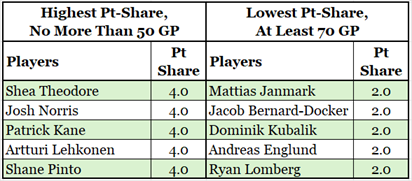
On the right side of the table above are the lowest-rated players who played at least 70 games. Again, there are two Senators on the list, causing Senators’ fans to feel like they just got a punch in the jewels.
Points Above Replacement
Another way to use Point Share is to state how a player compares to a replacement-level player, a player who is good in the AHL and who would be called up to replace a failing or injured player. This is called “Points Above Replacement”: PtAR. It is a variation of baseball’s WAR, Wins Above Replacement.
A replacement player will be represented by the PtShare score of 2.5, which is the bottom of the Pt-Fringe category.
For a couple of examples, Auston Matthews (F, TOR, PtShare 11.5) would be +9.0 PtAR, which is 9.0 points above a replacement-level player. Ryan Reaves (F, TOR, PtShare 1.5) would be -1.0 PtAR, which is 1.0 points below a replacement level player.
Summary
Having been tempted to follow a path from curiosity to analysis to knowledge, a rating system called Point Share was created. Has this led to an increase in my knowledge? Yes. I learned at least three things.
#1) Any reasonable rating system will put players in roughly the same order. The best players in the league will rise to the top, the call-ups will drop to the bottom.
#2) Given that most statistics measure offense, it is impossible to rate forwards and defensemen evenly on the same scale without doing something extra for defensemen.
#3) I expected that players who are used a lot for defensive zone faceoffs would have their expected goal data impacted. I was surprised to learn that the impact is far more offensive than defensive. Their expected goals against (xGA) are a little higher, but their expected goals for (xGF) are a lot lower. If you are not a dab hand at scoring you have to be good at preventing the opponent’s dab scoring hands from scoring, if you want to play in the NHL.
Related Articles
Introduction to Productivity Rating
